A Look at Graphics: Framing an Interactive Painting
A Look at Graphics
Acclaimed artist Ben Chandler shares his expertise in designing adventure game graphics.
Creating adventure game scenery isn't just about drawing what we can interact with. True, this is the primary reason for it, to give us something to play with, but it's also important that we expand beyond this and add details and scenery that don't need to be clicked on, but that do fill up the rest of the space without overwhelming the interactive elements. In many compositions this means putting playable objects towards the middle of the scene, and putting the non-playable details around the outside, where the player is less likely to look. We are, in essence, painting our own picture frames for each scene.
(Click images for larger versions)
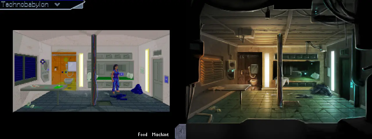
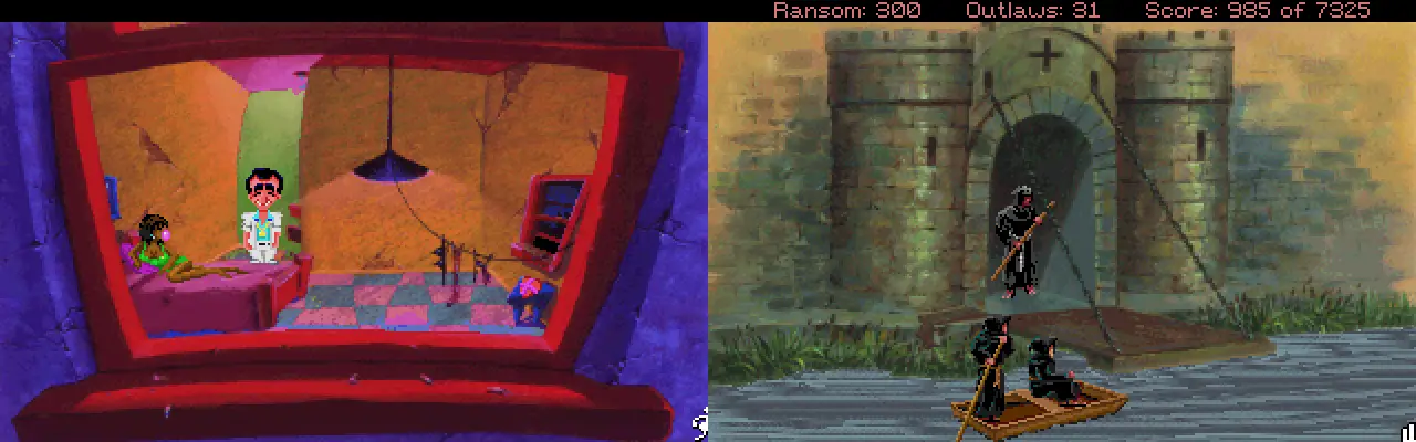
This is something I had to think about particularly carefully when converting this scene from James Dearden's first version of Technobabylon. The original scene was surrounded by a plain black frame – suitable for cutting the room down to size, but it didn't really represent the way I like to paint scenery. My preference is to fill the entire screen up, wherever possible, and so in reworking the scene I used foreground details to fill this space. I made sure not to use anything that looks important or distracting, instead relying on “greebling” – the old term for adding random bits of models to spaceship miniatures made for film special effects to make them feel more detailed.
The result is a kind of picture frame, literally, that fills up this void, without the scene feeling like it's been cut out. To me, the ability to fill up the entire frame is something to aim for, something that creates a more immersive, captivating scene, and utilizes all of the space, and still uses the “black border” idea – just in a more interesting way.
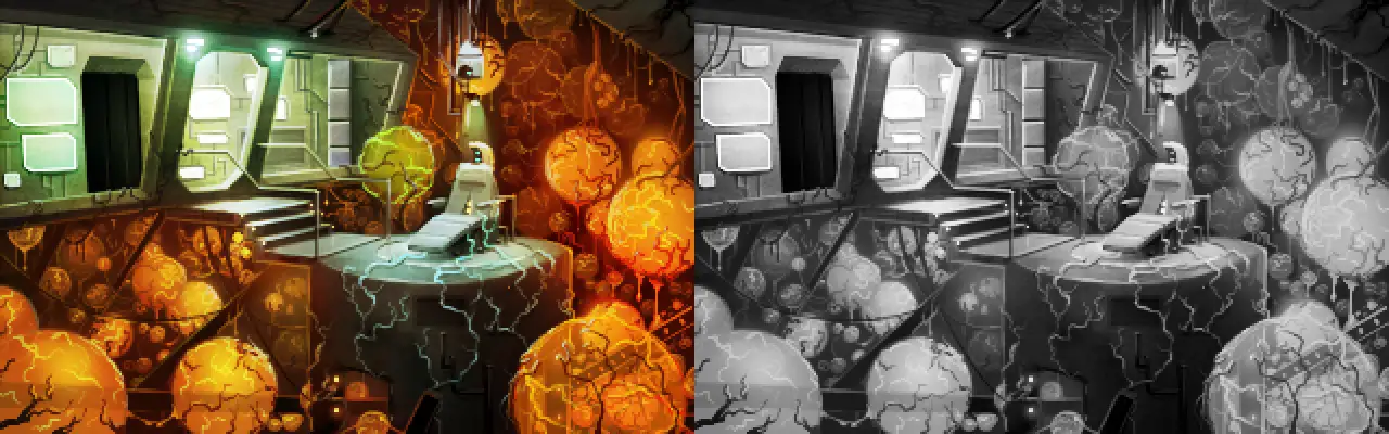
This particular scene from Technobabylon was an interesting challenge, because the design brief was fairly specific and interesting: I was asked to show a large amount of non-interactive space that was also quite detailed. In order to frame the interactive space properly, I made sure that the oranges of the framing details are mostly limited to the non-playable area, with the greys, blues and greens limited to the walkable areas, to set these two apart. To see how reliant the scene is on the differences in hue, compare the original to the black and white version on the right – suddenly the scene is more cluttered, more difficult to read, and it's much harder to determine, at a glance, where the player needs to focus. By framing the main area with details of a different hue, we can use as much colour and texture as we want without it ruining the feature's ability to frame the more important elements.

It's also useful to remember that sometimes framing can be more subtle. This filthy bathroom from Unavowed was a scene that I wanted to focus the player's attentions right on the middle, because there's a very important moment that begins as soon as we enter. The architecture here doesn't really support using foreground objects, so instead I added a secondary layer of walls closer to the camera, allowing me to darken the outsides of the scene dramatically. Compared to the room that leads into this one, which I framed with a darkish gradient on the walls like a vignette photograph, you can see how much darker and bolder this approach allowed me to go, really pulling the focus in closer to the centre.
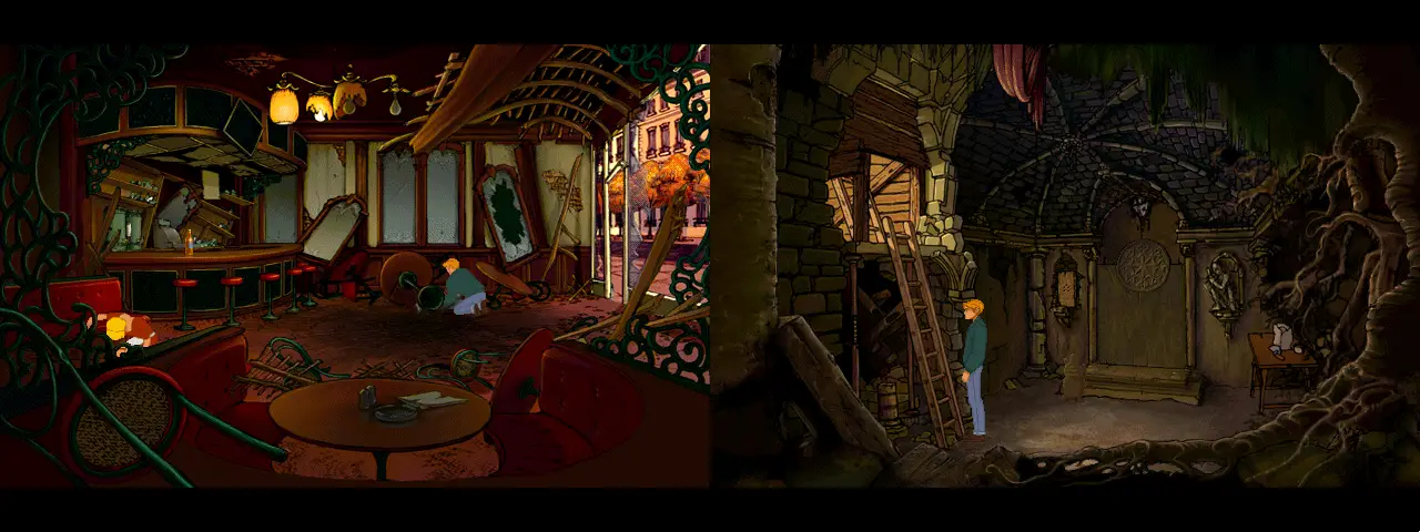
An interesting thing about these two Broken Sword: The Shadow of the Templars scenes is how the framing elements are rounded, despite the man-made nature of the locations. The exaggerated curved booth of the cafe, matched with the ornate decorations that surround it, effectively seals the scene off, with the waitress's position just in shot, sneaking in past an indentation in the ironwork. The second scene, with its curling tree roots closing off one corner, also makes use of a fallen slab in the bottom left corner, softening the transition to a straight wall with this angle. Both scenes show great examples of expanding a relatively small play area to fill the entire screen with detail wonderfully.
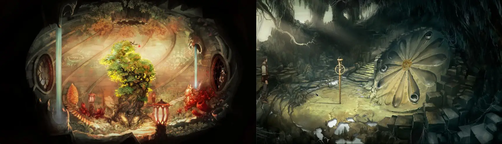
These examples from The Dark Eye: Chains of Satinav are interesting, in that they show two different approaches for fairly similar shapes and sized areas of focus. The left screenshot shows the artist directly painting a circle of black around the scene, which creates a very closed-in environment, whereas the right scene shows them expanding the scene to fill all the corners. This creates two very different effects, despite the similarity in the practical sizes of the scenes – the left one feels very confined, and while they could've easily added more to fill the screen, the black oval feels like it was a conscious choice, in order to make the scene feel more contained. The right scene's comparative openness is a result of the sky being shown in the top left, and by the fact that the framing elements in the bottom right corner mostly exist below the camera, not obscuring much of the scene, rather than in front of it.
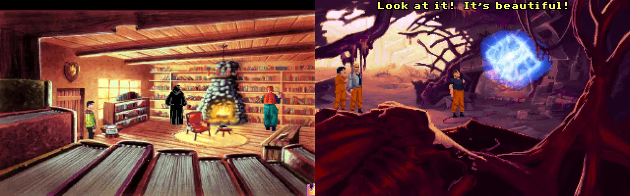
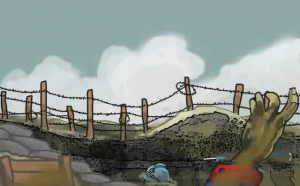
Here we see two examples of framing elements placed in front of the camera, and the effect is a much less open feeling. The King's Quest 6 screenshot on the left blocks off a large section of the floor, and even a significant portion of the door, with a bookcase, making for a cramped and crowded scene. The scene from The Dig on the right fills a similar region using alien landscape, with some vague details suggesting form and structure. The main thing, in both scenes, is that the details in these framing elements aren't really noteworthy – they're fairly generic and simple, a powerful element when designing framework. They're not the black silhouettes of, say, Day of the Tentacle, but the additional detail in these doesn't distract much from the centre of attention, because it's not very eye-catching.
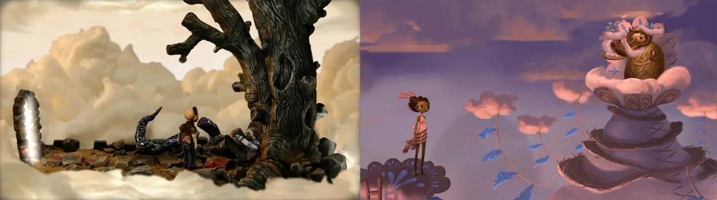
This is what makes a framing device effective: a contrast with the area of focus, whether of details, darkness, colour, or anything else. It's easy to get caught thinking framing elements need to be dark foreground elements, but the options are extensive. In the Dream Machine screenshot here, we see the opposite approach – a dark, detailed area of focus, surrounded by white clouds that draw our attention into the middle. In the Broken Age screenshot, our areas of focus are even more specific, just two small areas, on the left and right. A lack of sharpness makes both of these work – our eye naturally goes to the sharper details, meaning the less sharp surrounding elements frame them both perfectly.
Ultimately, artists are quite free to frame a shot as they please. Whether literally blocking the scene's edges with a window frame and wall, as in the Leisure Suit Larry screenshot here, or simply painting less and less detail and colour towards the outside of the scene, as with the Conquests of the Longbow scene to its right, what really matters is that the player's attention is drawn towards the important parts they need to interact with. Everything else is merely decoration; literally, a fancy and fitting picture frame with which to decorate our games, filling up that empty space, and perhaps having a little fun and being a creative while doing so.
Ben Chandler is an acclaimed adventure game artist and designer who now works with Wadjet Eye. If you enjoy his freelance article series at Adventure Gamers, we encourage you to check out his equally insightful blog about art in games.