A Look at Graphics: Using Lighting to Convey Mood
A Look at Graphics
Acclaimed artist Ben Chandler shares his expertise in designing adventure game graphics.
Hello! My name is Ben Chandler and I've been interested in the creation of art for adventure games for a number of years now. I started tinkering with designing my own games when I was 18 years old, making various small things for years until eventually being hired by Wadjet Eye Games as an artist. I've been fortunate enough to work on a number of their titles, and have been working full time with them for several years now.
The art of adventure games is a fascinating subject to me, and one I study regularly. I'm trying to decipher the visual language of the genre, so to speak, and figure out what makes them look great, and what influences both the conscious and subconscious decisions artists make when they work. It's an endlessly deep subject, and one I love investigating. Once we understand some of the things that make an image work, we'll never look at a scene the same way again.
When creating scenery briefs, writers often use words that can be a little odd to translate to a visual concept. “Moody”, “Atmospheric” and “Inviting” come to mind, and adjectives like “Oppressive” and “Cold” litter the many descriptions of backdrops that make an adventure game. These words do evoke images, but it can be hard to pinpoint exactly what it is that allows us to capture the feel these writers are asking us to convey in a scene. One excellent place to start, for me, is with lighting.
Light and darkness had their place in our virtual adventures long before graphics were a feature. Consider the importance of lamps in Colossal Cave Adventure or Zork – pioneers of the genre that understood the thrill of exploring a dark environment with a limited resource to light the way. Darkness feels mysterious and dangerous to us, just as ample light feels welcoming and safe. These inherent implications tied to light and darkness are an artist's friend, and go a long way toward helping us achieve a desired atmosphere in a scene.
(Click any image for a larger version)
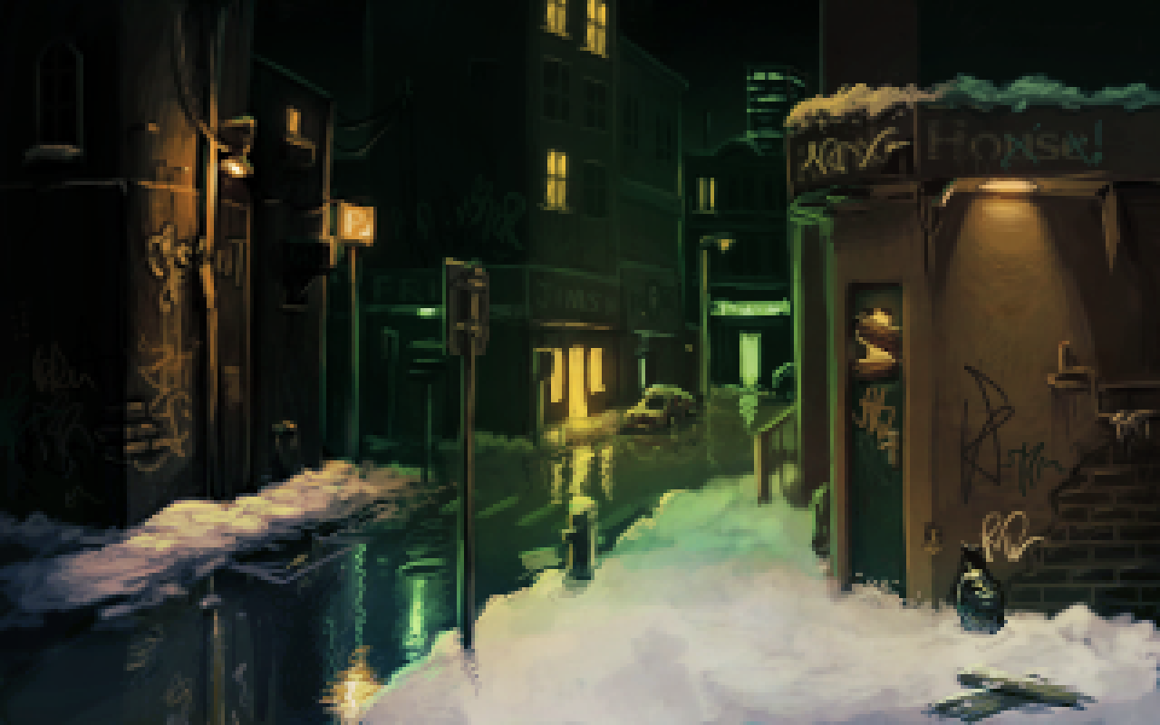
I've found lighting incredibly useful in my time as a background artist. In The Blackwell Epiphany, Dave Gilbert's script called for an eerie, oppressive feel, and I shunned the usual blue shades that night scenes have for a more unconventional green ambient glow that, to me, captured the gloomy and mysterious feel of the game's environments. A big inspiration for this was the green hue a lot of the 'found footage' representations of paranormal stories feature as a result of shots captured in night mode, a visual archetype that I was willing to capitalise on. To contrast this, I used warm, welcoming yellowish lights in certain spots, which I felt would act as pockets of familiarity among the enigmatic green glow.
When working with James Dearden on Technobabylon, we wanted to capture a city whose every aspect is reliant on high-tech living. For this I switched to using very cool, stark lighting – the unnatural glow of blue displays and holograms, and the harsh white light that can only come from man-made lighting. By avoiding warmth in all but the smallest of lights, I tried to make many of the scenes look sterile and free of natural influence; a cold, unwelcoming city. Much of my influence for this came from the cold lighting in other cyberpunk and science fiction titles like Deus Ex: Invisible War, Ghost in the Shell and Tron.

When working with Francisco Gonzalez on Shardlight, the world in question was a much more sickly, devastated affair. Here we had a destroyed, post-war world with an environment that was desolate and an atmosphere ruined. The sun was intended to feel harsh and unforgiving, the warm yellows and browns of the glowing sky representing a hot, dry atmosphere filled with dust. In addition to the yellows of the sun, I used green highlights in the form of shards of glowing glass to give a poisoned feeling. I still used blue lights in a few places, saving them specifically for electrical devices, such as the light that can be seen in the tunnel here. So strong are the connotations of radioactivity from the bright green glow that many people assumed the glowing shards of glass were the source of the game's plague – a testament to how powerful the connotations of a particular hue can be.
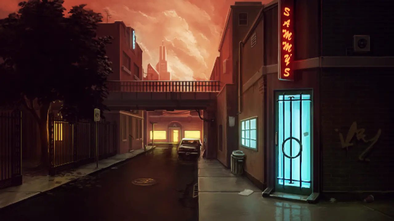
Unavowed, my current project with Dave Gilbert, represents a different atmosphere entirely. The intent is to represent a contemporary New York City, much like Blackwell Epiphany, but rather than the ghostly greens of that title, here we were looking at a more infernal story, and studying comics such as Hellblazer showed me just how effective red and pink skies can be for this sort of atmosphere. You can see here how the sun sets the sky ablaze with a hot, oppressive red that catches the buildings and clouds. It's not dark and gloomy like I was going for in Epiphany, but it's ominous nevertheless. You can also see how I tried using blue and yellow light in the doors and windows of buildings to humanise them as compared to the red glare of the sun.

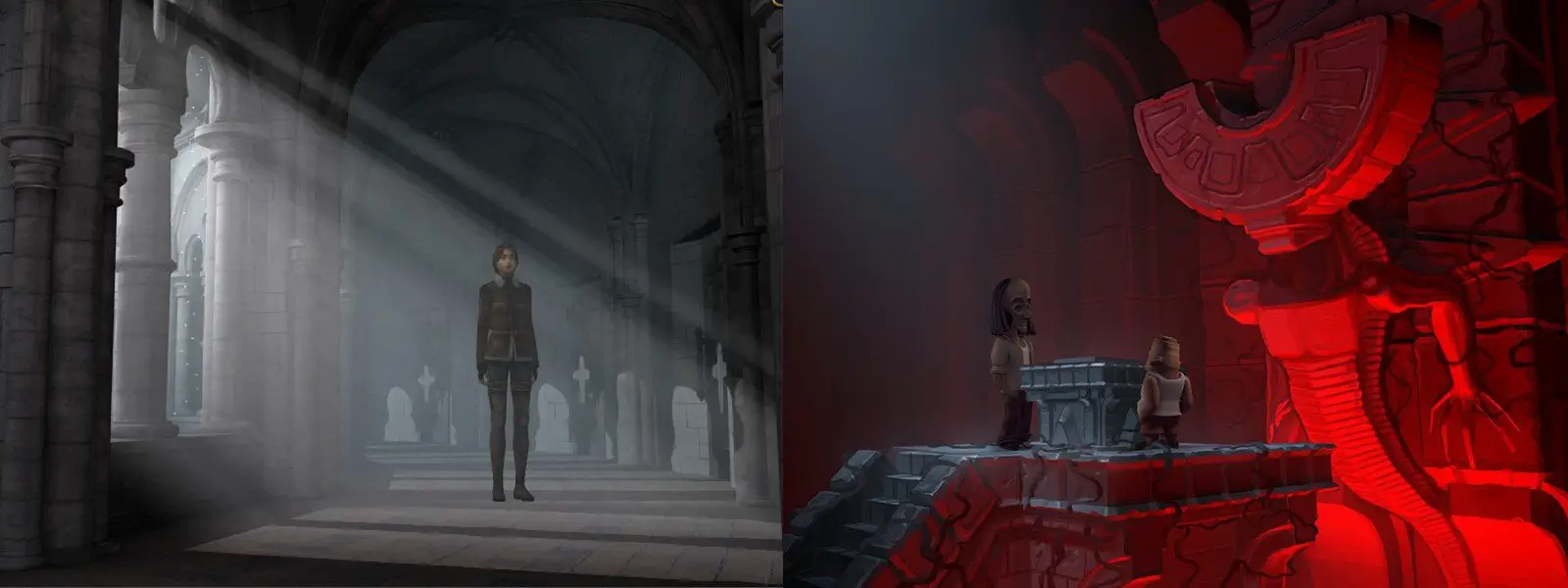
As a player, lighting in games has impressed me in titles as early as Loom in its EGA splendour. I love the way Bishop Mandible's cathedral creates a very dark, recognisable silhouette against the evening sky, and the way the sinister green light bathes the tombstones of the graveyard in an ethereal glow, adding to the foreboding presence of the already menacing structure. Compare how foreboding the dark palette with its sinister green glow feels to the much brighter, friendlier castle scene from King's Quest II. Even the presence of an eerie dead tree in the distance and haunting ghosts guarding the door can't compete with the evocative lighting of Loom.
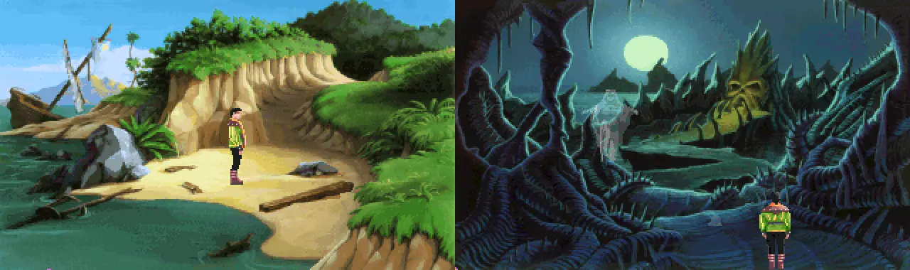
The VGA era brought more potential to play around with lighting, and games like King's Quest VI took excellent advantage of this. From the sunny and pleasant Isle of the Crown to the gloomy lands of the dead, the artists used different lighting conditions to convey specific atmospheres. The sunny beach scene here feels calm and friendly, even with the presence of the wrecked ship – the weather looks clear and fine, and the path is well lit. By contrast, the lands of the dead present us with shadows and an otherworldly glow that emphasises the already grotesque landscape.
The colour of light plays a massive role in how it makes us feel. Notice how compared to the sunny, yellow KQ6 shot above, the white light of Syberia 2's daylight feels cold and wintery. This scene from Syberia 2 is particularly interesting because it uses pure white “God rays” to give an air of reverence to the stony monastery, a visual icon we're familiar with and understand immediately. Compare that to the sinister red lighting of the shot from The Journey Down: Chapter 3, which seems mysterious and dangerous. It's not just the vivid red light that feels threatening, either – the angle of light coming up from below lights things in an eerie, unnatural way that lends great visual language to the scene. I like to think of this as the “flashlight under the face” angle – the unfamiliarity of it makes us uneasy.
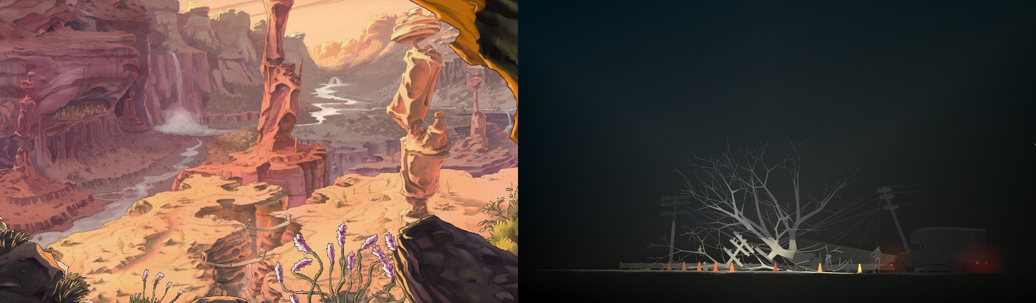
Direction plays a big part in lighting's power – the screenshot from Runaway here shows what photographers refer to as “The Golden Hour,” where the late afternoon sun is warm and lazy, and shadows are long and soft compared to the harsh shadows cast by the glare of the midday sun. The light is really allowed to flow through the scene, giving it a very pleasant glow. The image from Kentucky Route Zero shows a much more directed light; here the headlights act as a spotlight, directing our attention immediately to a very specific location, and the beams of light cut through the darkness with a hard edge. This feels more like a single, particular feature in an environment than a full landscape, and the way it emphasises the forms of the trees and power lines is immediately eye-catching.
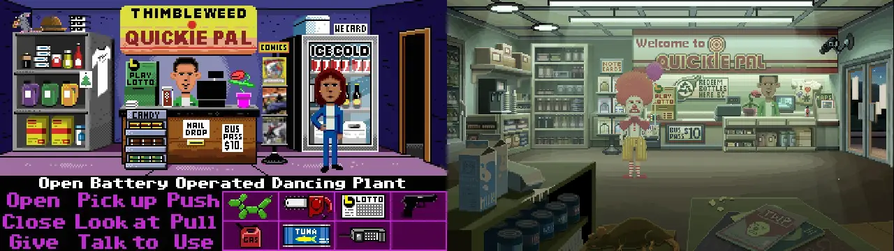
One of my favourite examples of the true power of lighting to convey a mood is the upcoming Thimbleweed Park. Compare the two versions of this location – from the simple, basic original to the reworked version with its sickly fluorescent lights that capture the feeling of a late night convenience store perfectly. While objectively being the same location, the reworked version tells a much more convincing story, and really increases the immersion of the environment.
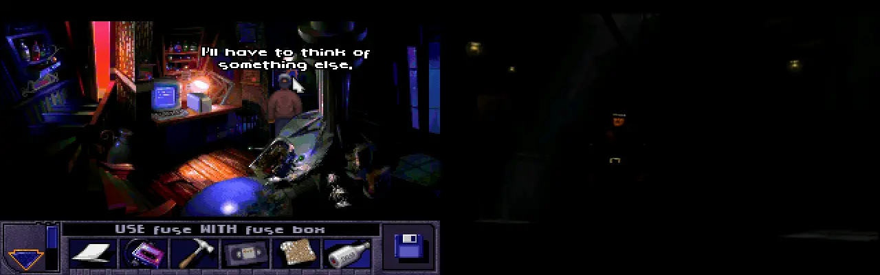
One last important thing to note: as evocative as light (and the lack thereof) can be, it's essential that playability remains the chief concern. As interesting as the dark, gloomy scene from Alien Incident is here, the odd lighting makes it quite hard to see where we can go, what we can use and even what some of the things are. Discworld Noir's warehouse, pictured to the right of it, takes things to an even further extreme. While flashes of lighting periodically help, the fact remains that the warehouse is incredibly hard to search because of the extreme levels of darkness, further hindered by the fact that the designers wanted us to find a very small item.
Lighting, then, is a powerful force in adventure game art, and presents us with a very diverse range of tools to help set the scene. It's impossible to overstate how much tone can be conveyed with a very carefully chosen lighting set-up, and I hope this very brief introduction demonstrates some of the decisions artists consciously make with their lights in order to tell a story. I'm always on the lookout for interesting uses of light when I play adventure games, and background artists never cease to impress me with how they use it to tell their stories.