Adventure Architect #2 - Chivalry is Not Dead, Part 5
NOTE: At the time of writing, Chivalry is Not Dead has finished production and is now undergoing beta testing. Visit the official website on Saturday, October 13 for its grand unveiling!
Conventional wisdom often states that you can't judge a book by its cover, implying that the ideas and themes behind a work of art are far more deserving of one's attention than its surface elements. While I do agree with this sentiment to a great extent, this isn't to say that such surface elements are unworthy of attention altogether; on the contrary, putting a decent amount of thought into a game's aesthetic style can go a long way in actually enhancing the ideas present within. This article, therefore, will delve into the art direction and interface design of Chivalry is Not Dead.
 From the beginning, I deliberately sought to distinguish Chivalry's visual style from those of professionally-developed games. The most obvious reason for this was simply because, unlike commercial game companies with dozens of highly skilled people working on art alone, I simply do not have the time, talent, resources, or patience to create graphics with the same high level of detail, whether they be hand-painted 2D or nearly photorealistic 3D. More importantly, however, given that the very nature of Chivalry is that it is a game created by one single person rather than by a corporation and thus has the freedom to explore ideas on a far more personal dimension, I believed that the game's art would do well to convey this independent aesthetic. I wanted to prove that creating a style that looks good does not necessarily imply creating a style that copies those of past games. Instead, I firmly adhere to the notion that every game developer can and should bring their own unique look to their work.
In the same vein, I also did not wish to go the pixellated retro 320x200 route, as seems to be popular with many Underground adventure games in recent times. This is due to the fact that, ultimately, Chivalry is not a game about nostalgia; while its roots and inspiration may derive from classic adventures, it isn't meant to emulate classic adventures. My goal is to demonstrate that I am attempting to create something new and forward-thinking, and I, personally, feel that if I were to use low-resolution graphics with a such a distinctively retro aesthetic, I would not be sending that message across.
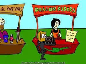
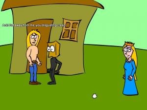 Hence, the style I have adopted for Chivalry is a very iconic and simple one, with smooth, thick lines and bold colours similar to what one would see in a comic strip. I create this style by sketching from an old, cheap drawing tablet straight into Flash, then exporting the vector graphics generated into PNG files with alpha channels, to be viewed in-game at an 800x600 resolution. By keeping my methods relatively low in complexity, I find that I can generate art assets a lot more quickly, allowing me far more time to focus on the game's content while still allowing for a look that I find visually pleasing.
Looking at the screenshots, you may notice that I have gone for a very minimalistic look in comparison to many adventure games, with sparse backgrounds and few objects to interact with. This, too, is very deliberate, as Chivalry is primarily about people rather than things; most of the gameplay, after all, is dialogue-based rather than inventory-based. Character sprites, on the other hand, are a bit more detailed, but still very iconic and cartoonish, and are animated very simply rather than realistically. I have done this first and foremost as a matter of personal taste and talent, but also because cartoon characters, by nature, are far more adept than realistic ones at conveying symbolism, favouring my artistic tendency towards abstract ideas as opposed to concrete representations.
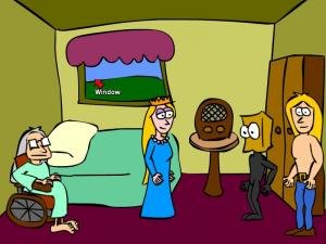 Adding to this general sense of minimalism is Chivalry's interface, in which all interactions happen by merely clicking on characters and objects, and Phlegmwad's rather limited inventory appears as a single bar accessed by hovering over the top of the screen. I felt that having fewer buttons and settings for the player to fiddle with on-screen would divert greater attention to the content of the game itself. Furthermore, by keeping possible verbs to a minimum via a one-click interface, I wanted to reduce the number of default "I can't X that" responses as much as possible, as I often tend to find them irritating. In many games with so-called "guess the verb" tendencies, it seems as though the interface is a puzzle in and of itself. Considering that one of my goals is to make Chivalry as accessible as possible to those who do not regularly play adventure games, I find myself erring more on the side of friendliness rather than frustration in this case.
The end result of all this, in my opinion, is a product that looks and feels very smooth and polished, while at the same time possessing a stylistic flair that gives the game an unmistakable personal touch echoing the independently-developed nature of its content. Next time around, I'll be posting the final article in this series, which will entail taking this finished product I've created and finally unveiling it, first to a small group of testers, then to the world at large.