Adventure Gamers - Forums
You are here: Home → Forum Home → Gaming → Adventure → Thread
Post Marker Legend:
-
 New posts
 -
 No new posts
Currently online
And the title of the next Simon The Sorcerer is…
Well apart from the body proportions, which is clear enough, his face features are a little on the grotesque side, but not in a funny way so to say.
Simon is a cunning brat, but his face both in the screenshot and in the logo doesn’t reflect that. When I think of Simon Wreckless Eric comes to mind for example.
Maybe you should also place several variations and let the people give their opinion and by no means you are entitled to accept it, just to have a clearer picture what the audience is expecting from this big come-back.
No 6 for me (that makes me think I’m asking for a packet of fags!) it’s the best, to my eyes, by a distance.
Life is what it is.
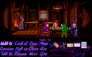
The screenshot looks great. If that’s the art style you’re using for the locations, then that’s spiffy!
Simon’s design seems indeed to be too tall. Make that same design 20% shorter (but not necessarily thinner), and maybe close the upper part of his wizard coat (so we don’t see what he’s wearing underneath - except his jeans - like how he’s depicted in the first two games), and I’d reckon you’re there.
As for the logos: #1 is too simple and I don’t particularly like #3, #4 and #5.
It’s either #2 or #6 for me.
The truth can’t hurt you, it’s just like the dark: it scares you witless but in time you see things clear and stark. - Elvis Costello
Maybe this time I can be strong, but since I know who I am, I’m probably wrong. Maybe this time I can go far, but thinking about where I’ve been ain’t helping me start. - Michael Kiwanuka
Logo 6 is my favorite. The dual faces don’t really read at range so the two colors works better.
I personally think the new Simon design looks great. I don’t see what the problem others are having is. He looks like he matches the background art style.
Adventure Gamer Since 1992
I personally think the new Simon design looks great. I don’t see what the problem others are having is. He looks like he matches the background art style.
I actually agree with this. I think it’s a great design. I think the issue people are having (and not able to fully articulate, which is why they’re defaulting to “he’s too tall”) is that the arms are a bit too short, and the legs just slightly too long for the proportions of the rest of the body. The leg length you could chalk up to cartoon proportions, but the arms are anatomically incorrect—when an average person stands in a relaxed pose with their arms at their sides, the finger tips should reach mid-thigh, or even slightly lower. In the current version, the fingertips only reach a point just below the character’s waist, and as a result, it makes the whole body seem slightly elongated.
The other detail that I think is throwing people is the length of the coat. In the first two Simon games (the most iconic ones anyway,) Simon’s coat is always long enough to drag on the ground. The fact that it’s so much shorter here might also be messing with the perception of the body’s proportions.
We’re on the case! We’re fixing proportions already, and in the next couple of days we’ll also be showing up some different variations of the face to get some votes also.
Does this looks better in terms of the arms?

Simon (the Sorcerer) doesn’t appreciate that you’re not following the news of his upcoming adventure!
http://www.storybeasts.com is the place to go for updates and such.
Yeah, that looks better—to my eyes, anyway. ![]() He still seems a bit lanky, but proportionally correct. I’d be curious to see the whole design widened slightly—might solve the lankiness issue.
He still seems a bit lanky, but proportionally correct. I’d be curious to see the whole design widened slightly—might solve the lankiness issue.
The logo versions presented aren’t all that great - any of them, really. It’s too much of the same style all at once.
You should mix it up by having the title and subtitle in different fonts/designs. The way it is now it all blends together too much, even with some fancy graphics inside the O. There should be a clear distinction that the brand is “Simon the Sorcerer” and that “Between Worlds” is the subtitle.
I would personally keep the logo version with the book, it looks good, but then change the style and color of the subtitle up. This is more or less the standard thing to do with game logos featuring subtitles - you make sure that people can easily tell them apart without thinking about it for even a second. This blog features a lot of game logos, many of them games with subtitles, more or less all of them stressing my point: http://gamelogos.tumblr.com/
Logo aside I really like the environment art on show and with a little work the new Simon could be great.
Nice! Another good oldies coming back.
Yikes, why is he so pale? Are you sure you’re not remaking Simon the Zombie?
I’d go back and look at the original’s color palette. Bright and sunny, and very beautiful.
I like logo #2 the best. And I REALLY like the environment art posted in that screen shot of Simon.
I don’t mind the way Simon looks too much. The description says this Simon is 20 years older than the last time we saw him. I think it’s good that he does not necessarily look the same as he did as a kid. People change quite a bit over the course of 20 years.
Yikes, why is he so pale? Are you sure you’re not remaking Simon the Zombie?
Check your monitor brightness, because that’s normal flesh tone if I’ve ever seen it.
Adventure Gamer Since 1992
I think I like logo no. 1 best.
The blue/purple in the O is a bit too dominating compared to the golden colour of the rest of the logo, and the golden faces in 2 just doesn’t work as I see it. I would definitely keep the book logo and the whole top part of 1, 3, 5 and 6, regardless of what you do with the bottom part.
If you want to keep the blue/purple, then I think 5 is the best one.
Edit: Regarding Simon, then I think it would be a nice touch if he had a bit more stomach, not outright fat just a bit more round.
You have to play the game, to find out why you are playing the game! - eXistenZ
Yikes, why is he so pale? Are you sure you’re not remaking Simon the Zombie?
Check your monitor brightness, because that’s normal flesh tone if I’ve ever seen it.
Sure, if you live in Siberia.
If it is Simon 20 years later, he has either spent those 20 years playing AGs in his attic or invented a reverse-tanning sunbed.

I’d go for logo number 6 from those as well.
I think the logo needs more colour that just the gold (i.e. the “O” of “Worlds”) but it also needs balancing. I would suggest that the “O” of “Simon” should get the same treatment as the “O” of “Worlds”. Or something like that just to add the balance. At the moment the eye is drawn to “Worlds” and I think “Simon” is equally deserving of emphasis. Also you have some form of symmetry at the bottom and the top that way.
3.5 time winner of the “Really Annoying Caption Contest Saboteur” Award!
You are here: Home → Forum Home → Gaming → Adventure → Thread


